Brave King: A Display Font That Commands Attention—Not Just Decoration
I was halfway through building the thumbnail series for a client’s new YouTube content series—“Bold Starts,” a six-part mini-course on launching creative side projects—when I paused. The draft headline in our usual clean sans serif looked *correct*, but not *compelling*. It blended in. So I swapped it for Brave King. Instantly, the frame had weight. Not loudness—just presence. That’s when I knew this wasn’t just another vintage display font. It’s a visual anchor.
What Brave King Actually Does—Beyond “Retro Cool”
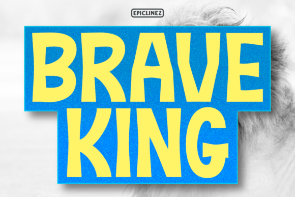
Brave King is an all-caps display typeface with bold, slightly uneven strokes, subtle ink-trail texture, and confident spacing. It doesn’t mimic 1950s signage or 1970s album covers outright—it borrows their authority, then tightens the focus. Think less “vintage filter,” more “vintage intention.” Its personality is direct, grounded, and quietly assertive—not aggressive, not playful, not nostalgic for nostalgia’s sake. It communicates clarity before charisma.
In campaign visuals, that translates to immediate message hierarchy. When you place Brave King over a muted background or beside a product photo, it doesn’t compete—it clarifies. It tells the viewer: This matters. This is the point. That’s rare in a feed where most display fonts either shout or disappear.
Where It Shines (and Where It Steps Back)
We used Brave King across four key touchpoints in the “Bold Starts” rollout:
- YouTube thumbnails: At 120px tall, the caps held crispness even with light text overlays on busy background imagery. No blurring, no edge fuzz—even on Android preview thumbnails.
- Instagram carousel covers: First slide headers in Brave King, paired with a neutral sans serif (Inter, Regular) for body text. Scrolling slowed. People paused longer on Slide 1—not because of color or motion, but because the type felt intentional, like a title card.
- Pinterest pins for course teasers: Used at 48–60pt on vertical banners. The font’s generous x-height and open counters kept readability high even when cropped tightly by Pinterest’s grid layout.
- Email banner headers: Set at 36pt over a soft gradient. No tracking adjustments needed—the natural rhythm of the letterforms created breathing room without extra line height.
It works best for short, high-impact roles: campaign labels (“EARLY ACCESS”), quote callouts (“START BEFORE YOU’RE READY”), webinar banners (“JOIN THE LAUNCH”), or branded template titles (“BOLD STARTS WORKBOOK”). It’s not built for paragraphs, captions under 14pt, or dense comparison tables—and that’s by design. Respect its role. Let it lead, then hand off to supporting typography.
Readability in Real Conditions—No Guesswork
On mobile previews? Yes—Brave King stays legible down to ~28pt on light backgrounds, and ~32pt on dark (we tested with semi-transparent overlays). Its uppercase-only structure helps: no ascenders/descenders to clip, no lowercase ambiguity in tiny spaces. But avoid placing it directly over complex textures or low-contrast photos. It needs breathing room—or a subtle drop shadow (1px, 70% opacity) for separation.
We skipped it for Instagram Story text overlays under 24pt. Too much visual weight for fleeting context. Same for email body copy or landing page subheaders—those need neutrality, not declaration. Brave King earns attention; it shouldn’t demand it where attention is already given.
Smart Pairing—Because One Font Doesn’t Carry the Whole Campaign
We paired Brave King with Inter (a highly readable, open-source sans serif) across every asset. Why? Inter’s even rhythm and generous spacing balanced Brave King’s expressive weight without competing. For email footers or PDF workbooks, we added IBM Plex Serif for a quiet, editorial contrast—never fussy, always legible.
Avoid pairing it with other high-contrast display fonts or decorative scripts. It’s not a team player in that sense. It’s a front-line voice. Give it a calm, functional counterpart—not another soloist.
Before You Drop It Into Your Next Campaign
Check what’s included: Brave King ships as a single OTF file (no variable weight axis), so there’s one strong style—not light, medium, or bold variants. That’s fine for display use, but means you’ll rely on sizing, color, and spacing for emphasis instead of weight shifts. Also verify licensing: it’s a commercial font, fully cleared for digital ads, client work, and template resale—but not for embedding in apps or SaaS platforms without extended licensing.
No multilingual glyphs beyond basic Latin (A–Z, numerals, common punctuation). Fine for English-first campaigns, but plan ahead if you’re localizing for Spanish, French, or German markets. And while it has no ligatures or stylistic alternates, its consistent character width makes it predictable for dynamic layouts—great for CMS-driven banners or automated social posts.
Brave King won’t fix weak messaging. But if your campaign has a clear, confident core idea—and you need typography that reflects that without explanation—it’s one of the few display fonts that delivers authority, not just aesthetics. It doesn’t ask to be noticed. It simply is.